Google Fonts: Arrows
When I write something on the topic of 4-panel dance games, it’s inevitable I’ll end up using the arrow symbols (i.e. left, down, up and right).
This site uses Google Fonts to render the titles in Alegreya Sans, the main text you’re reading right now in Source Serif Pro[1], and code blocks in JetBrains Mono[2].
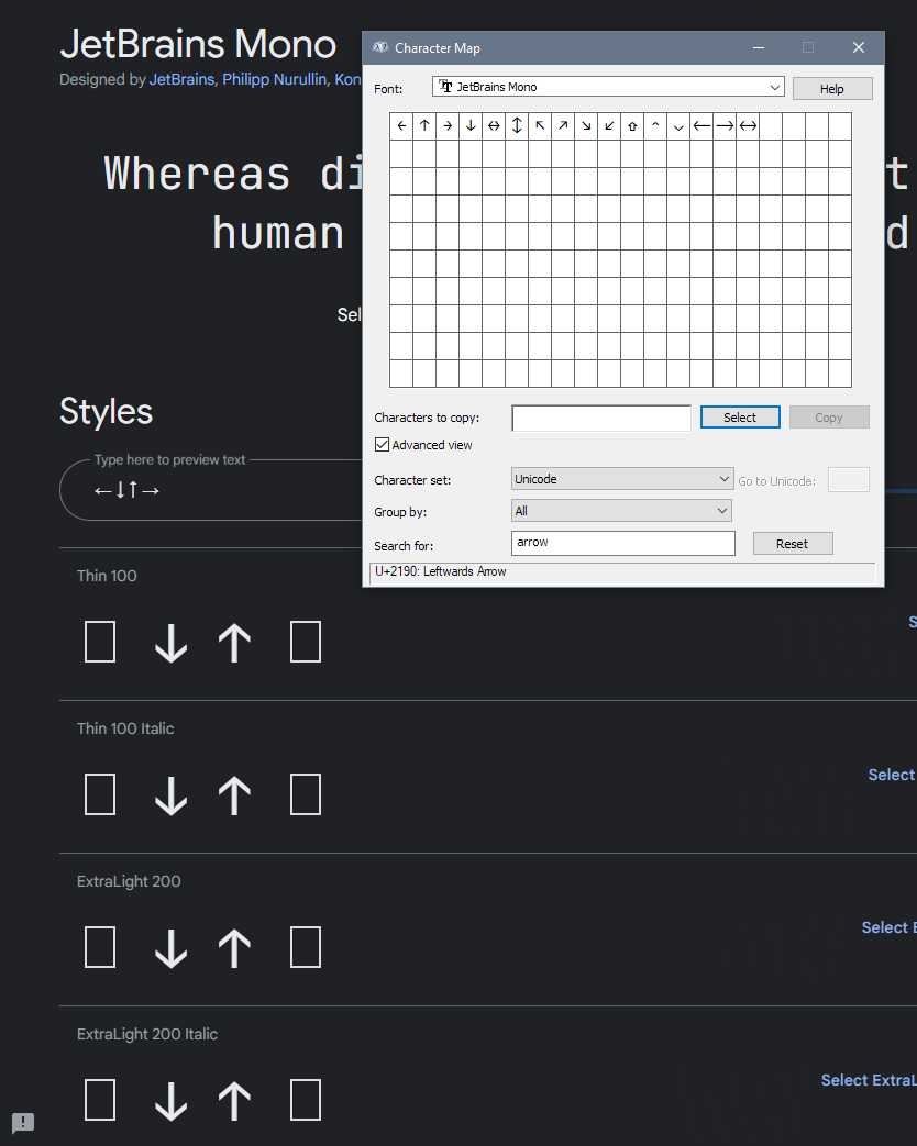
When I started to write some arrows in a code block (i.e. monospaced characters), I noticed something strange. They didn’t line up; ← and → looked different from ↑ and ↓ – on my phone, desktop, and iPad. So, I consulted Google Fonts to make sure I wasn’t tripping.

Huh. As my local installed font proves here, something’s up. Besides, it’d be absurd to design a font with only two of the four directionals. I dug deeper into why this was happening.
Vaguely recalling that Google Fonts had data optimisation features to only serve you the minimum required glyphs (think along the lines of the tens of thousands of Chinese characters in its language), I looked into the generated CSS.
@font-face {
  font-family: 'Source Serif Pro';
  font-style: normal;
  font-weight: 400;
  font-display: swap;
  src: url(/* font url */) format('woff2');
  unicode-range: U+0000-00FF, U+0131, U+0152-0153, U+02BB-02BC, U+02C6, U+02DA, U+02DC, U+2000-206F, U+2074, U+20AC, U+2122, U+2191, U+2193, U+2212, U+2215, U+FEFF, U+FFFD;
}latin subset (there’s others)The Unicode range here consists of all of the Basic Latin characters plus the following:
- 0131
ı(dotless i), 0152 lower caseœ(0153 is upper) - A selection of modifier diacritics
- 2000-206F additional punctuation
- 2074 superscript
4(²and³are in Latin 1 Supplement), 20AC€, 2122™ - 2191
↑, 2193↓ - 2212
−minus sign, 2215∕division slash - FEFF zero-width no break space, FFFD replacement character (same purpose as the unknown rectangle box)
You see that? There’s an up. There’s a down. But no left and right. Exactly the idea of footswitches.
It seems that to request the service of the few odd glyphs, you’ll need to call the API a second time with the text parameter. Arrows don’t belong to one of the language subsets Google Fonts provides, like greek, vietnamese, cyrillic etc. (They actually belong to a block literally called Arrows.) Therefore, you can’t combine the query into the same URL that requests the typefaces for general use.
&text=<your-characters> at the end, i.e.<link href="https://fonts.googleapis.com/css2?family=<fams>&display=swap&text=←→" rel="stylesheet">[1] I’ve looked far and wide for a free typeface that gets as close to ITC Charter that’s not Bitstream Charter. This one’s the best I could pick out.
[2] Fun fact: I prioritise Iosevka if you have that installed on your device. It used to look a bit weird back when it first came out, but now it’s pretty damn solid. Think of it as the poor man’s Pragmata Pro.

